
Creating Simple Visuals That Tell a Story
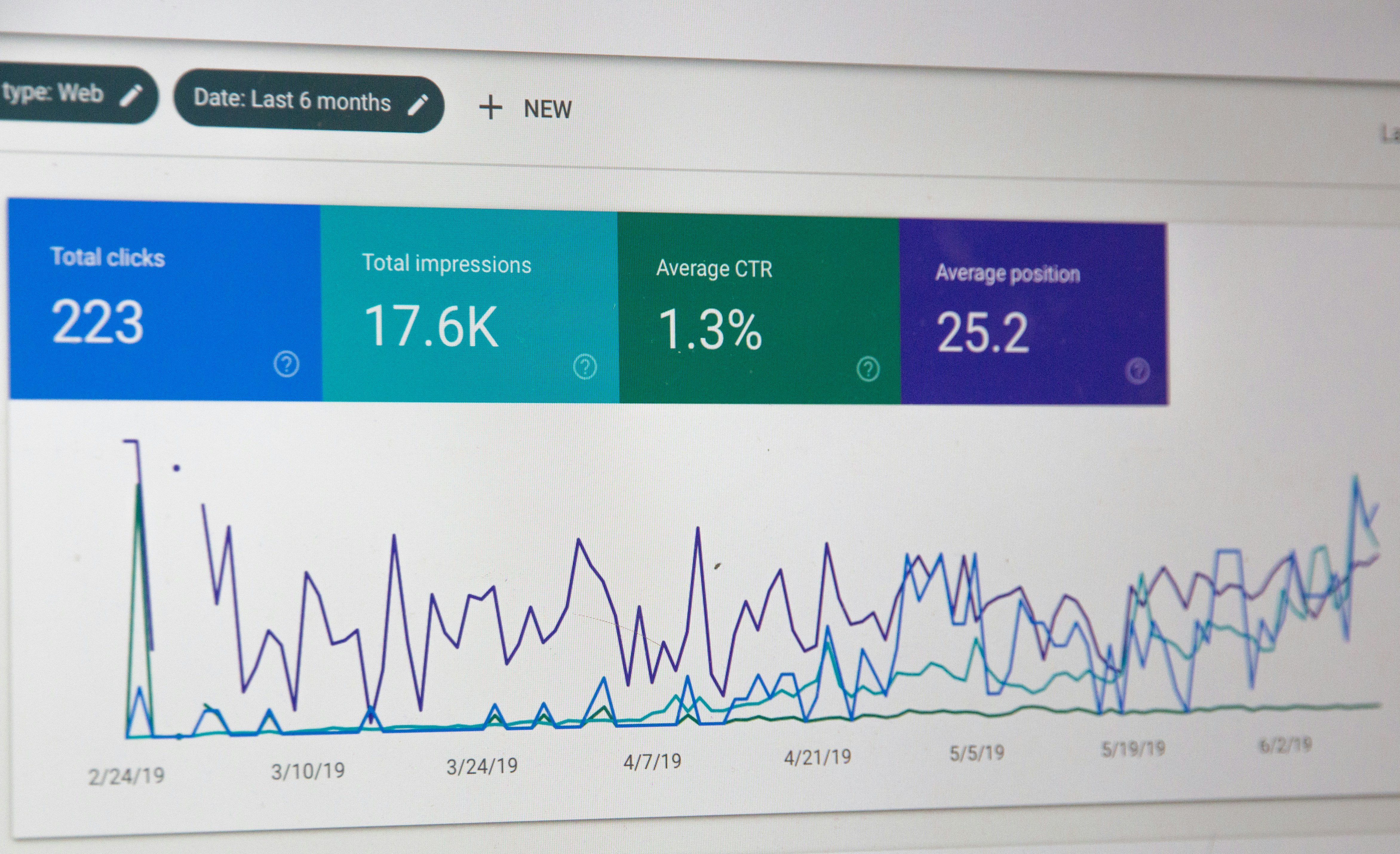
Numbers tell a story — visuals make it easy to see. In this lesson, we explore when to use bar charts, pie charts, and line graphs, how to choose the right one, and a few pro tips to make your visuals stand out. You’ll also learn how to create your first chart in Excel or Google Sheets.Read Full Article here

Credit Risk Classification
SMOTE & Machine Learning
Many lending institutions struggle with classifying loan statuses — especially when data is imbalanced. In this project, I applied SMOTE to oversample underrepresented classes, trained models like Logistic Regression and Random Forest, and visualized results with Power BI. The outcome? A more balanced classification model and actionable risk insights.
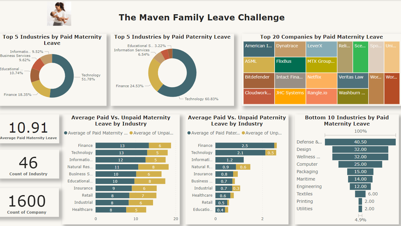
Family Leave Challenge
A Maven Analytics Competition
This Power BI project explores paid parental leave policies across 1,600+ companies and 46 industries. I cleaned and standardized industry data, built a new “Industry Category” feature, and created an interactive dashboard to visualize maternity vs. paternity trends and uncover equity gaps.

Tata Data Visualization
Empowering Business with Effective Insights
Shortly before embarking on my data journey, I set a goal to empower small businesses around me with tools to understand their data. Working with the Tata dataset brought that goal to life — with dashboards, insights, and visual storytelling that turn raw data into strategic growth.

Bike Sales Dataset Analysis
Excel · Power BI · Customer Insights
This analysis explores a bike sales dataset with demographic and regional variables. I used Excel and Power BI to identify buying patterns based on age, income, marital status, commute distance, and region. The goal was to uncover key drivers behind purchasing behavior to help a fictional retailer optimize strategy.

COVID-19 Layoffs
How Much More?
Layoffs have become a post-COVID reality — often with long-term effects on people and companies. In this project, I analyzed a dataset capturing industry layoffs and trends post-2020. Using Python and visualization tools, I uncovered insights about how different sectors were affected, the timing of layoffs, and which industries were most vulnerable.

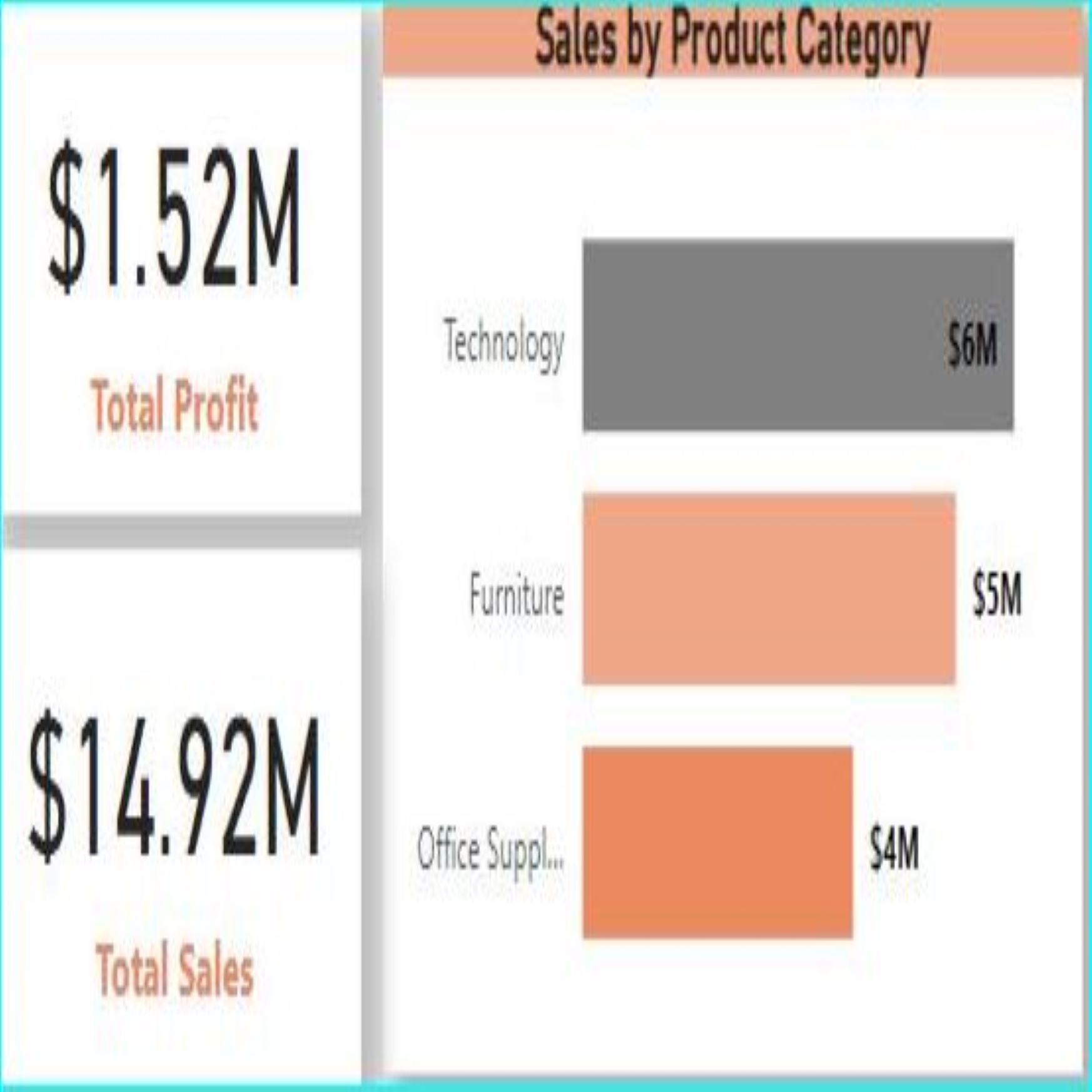
KMS Superstore Analysis
Tableau Visualization
This project dives into a retail dataset collected over four years — with 22 variables and over 8,000 rows. Using Tableau, I analyzed sales trends, customer segments, regional performance, and product profitability. The dashboard uncovers actionable insights to boost revenue and streamline operations.

Yelp Restaurant Reviews
Iowa State (2018–2022)
Analyzing over 4 years of Yelp reviews across Iowa, I explored customer sentiment and dining trends using Python. The notebook highlights top-rated restaurants, word frequency in reviews, and patterns by city and cuisine — offering insights into what makes diners happy (or not).
KMS Superstore Analysis
Power BI Dashboard
I recreated the KMS Tableau analysis in Power BI to compare tools. This version uses slicers and custom DAX measures to explore performance across regions, products, and categories — helping identify trends and opportunities for profit optimization.

Tata Data Visualization
Empowering Business with Effective Insights
Shortly before embarking on my data journey, I set a goal to empower small businesses around me with tools to understand their data. Working with the Tata dataset brought that goal to life — with dashboards, insights, and visual storytelling that turn raw data into strategic growth.